
Looking for inspiration for your next design? So often colour is the driver for our new creations and triggers a particular feeling we want to achieve whether it’s inspiring dressmakers or catching a mood with our couture collections.
Pantone is the world recognised authority on colour and is the go-to reference palette for designers in all markets. So, what is the Pantone colour of 2020?
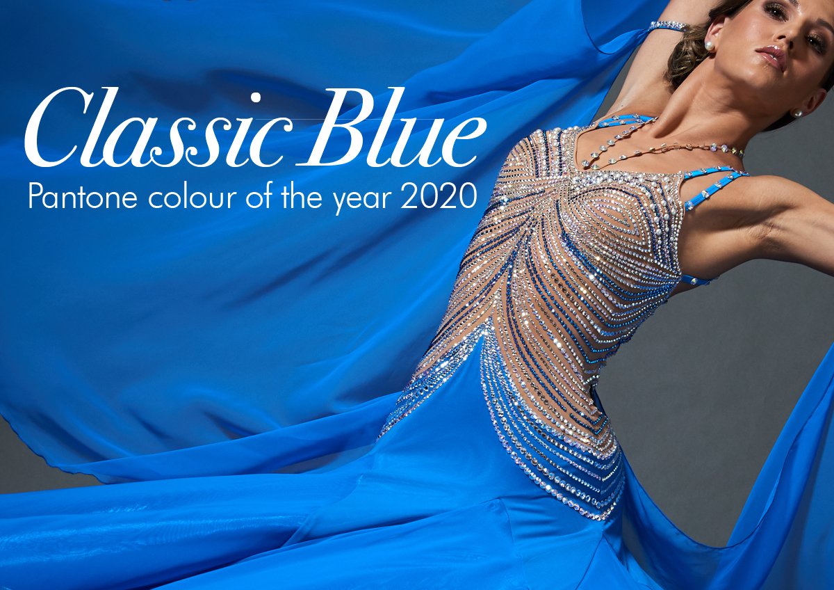
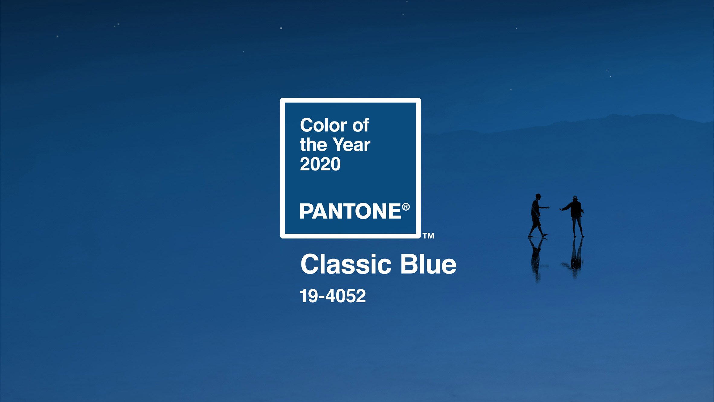
Enter Classic Blue 19-4052
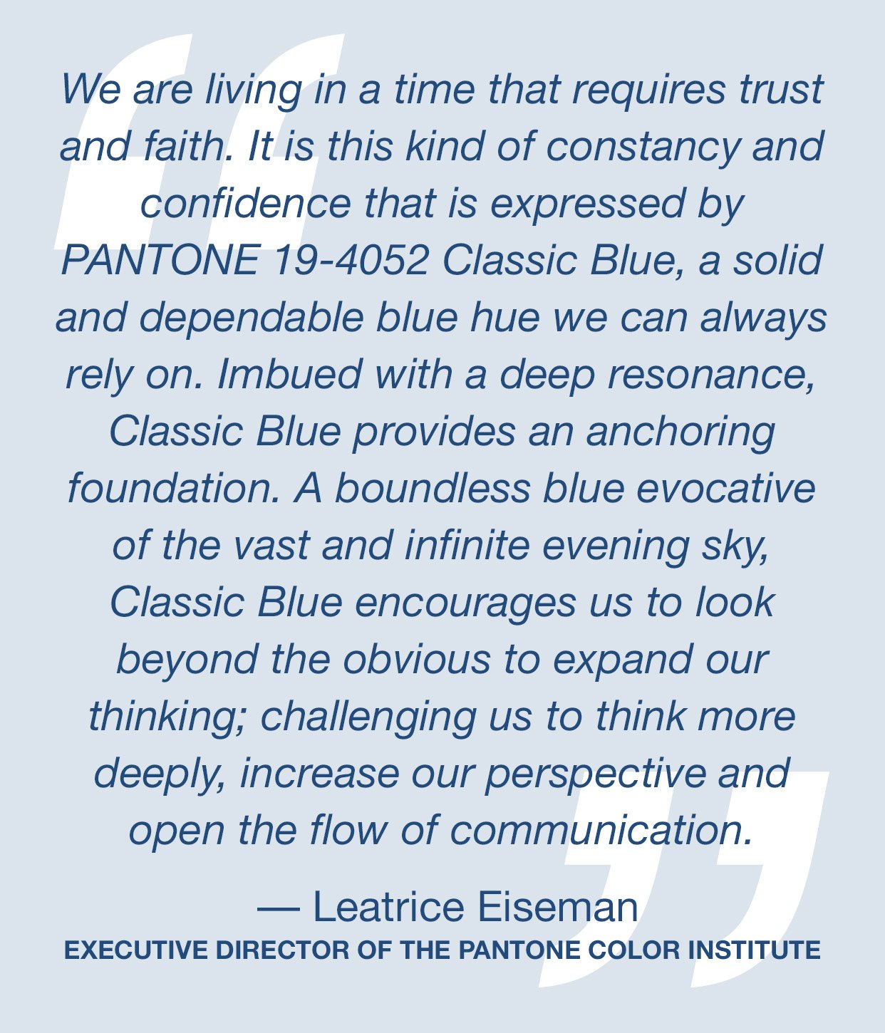
Pantone describe this colour as: “Instilling calm, confidence, and connection, this enduring blue hue highlights our desire for a dependable and stable foundation on which to build as we cross the threshold into a new era.”
At Chrisanne Clover we quite like this ethos of a solid foundation for design. Much of our design heritage is based around classic simplicity. Classic Blue is both reassuring and tranquil yet has hidden depths as we enter a new decade. The sense of peace and tranquillity it brings can act as an anchor in design as we build new ideas and bring additional adventurous elements into the design process.


Using Classic Blue as a Colour Palette Anchor
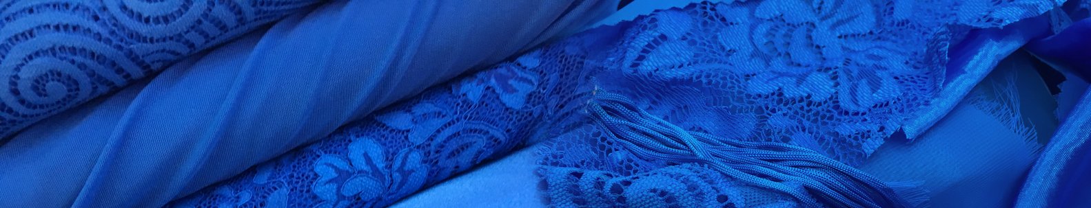
We have a wealth of colour options that sit within the sphere of classic blue.
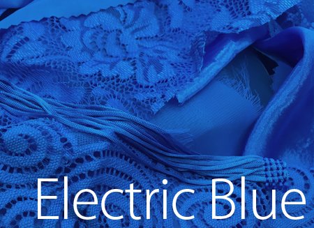
Our closest fabric matches: Electric Blue, Cobalt & Blueberry...


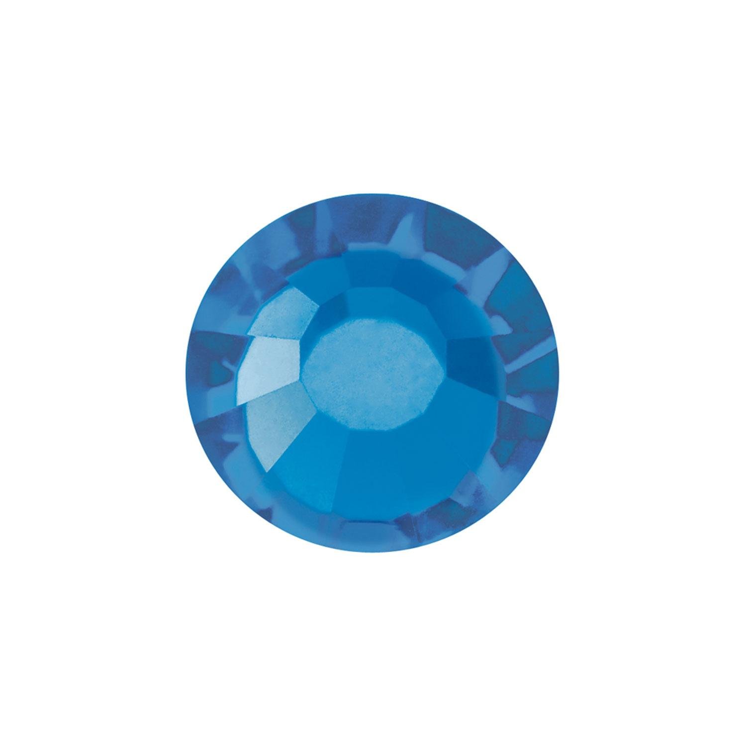
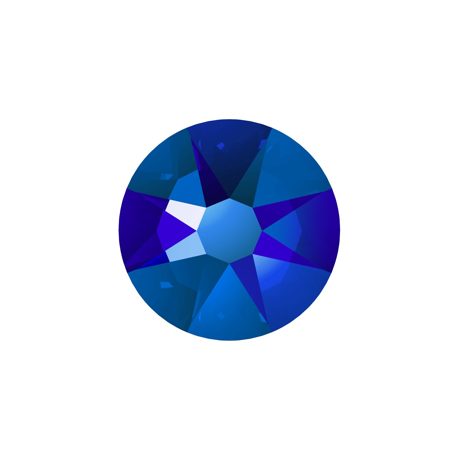
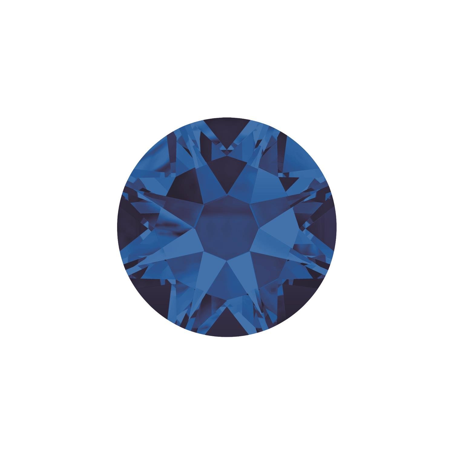
Complementary Crystal Colours
|
Electric Blue DeLite |
Bermuda Blue |
Cobalt Shimmer |
Majestic Blue AB |
Capri Blue |
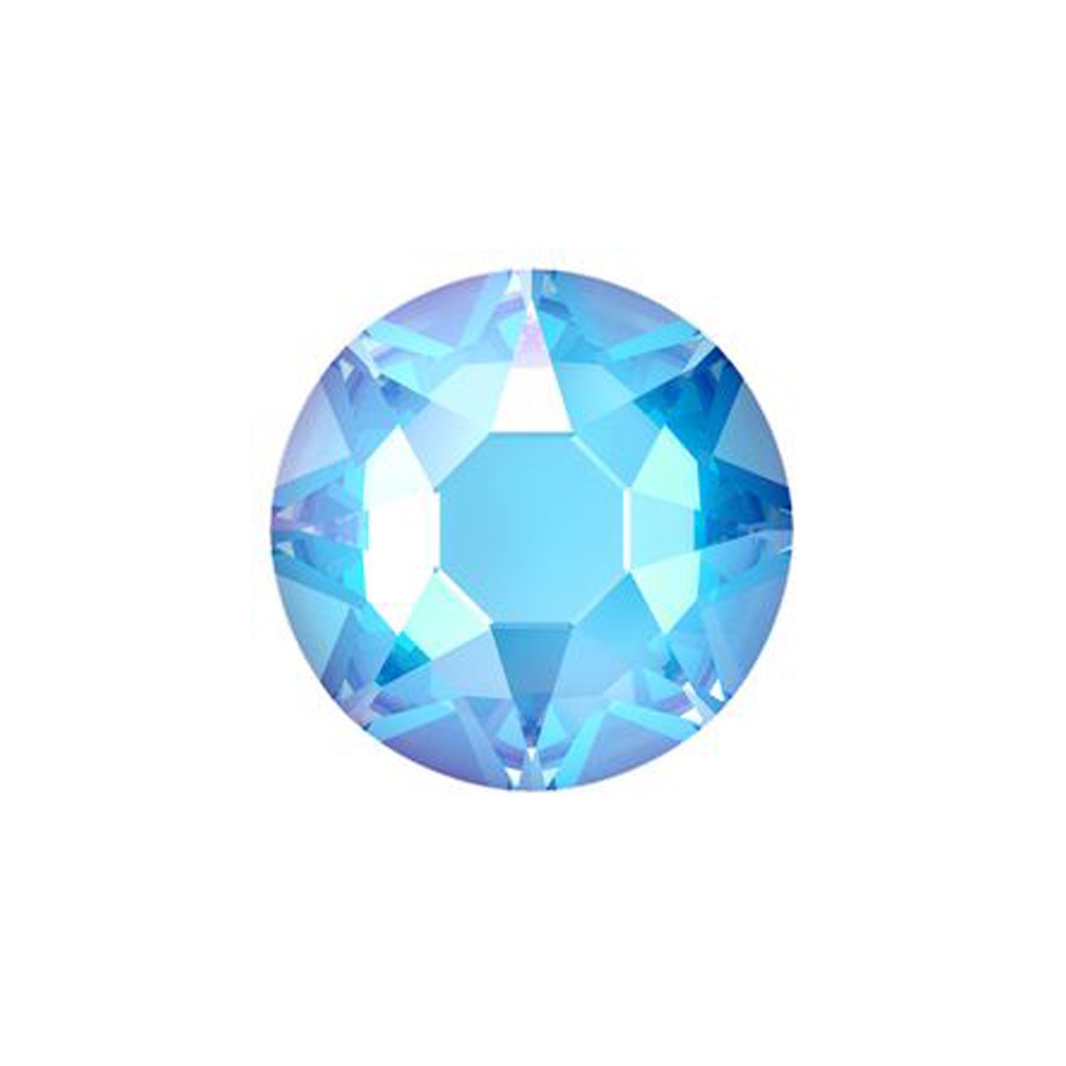
Electric Blue Delite > Cobalt Shimmer > Majestic Blue > Meridian Blue > Bermuda Blue > Capri Blue > Sapphire > Crystal Royal Blue Delite >
Design Suggestions
Have a play with contrasting colours and textures that take blue out of its safe zone. Whilst at the UK Open Championships in Bournemouth we saw some lovely colour combinations and inspirational use of fabrics on dancers from all around the world. Have a play with some new ideas:
· Mix up textures: try our ever-popular smooth velvet > in full length skirt panels and pair with some godets and floats in satin chiffon > or georgette >
· Add some depth and sparkle with shimmer velvet > and velvet gloss >
· Get creative with fringe > and bead droppers > on sleeves instead of traditional floats
· Look at paler blues and hues that range into purples to add depth and contrast with your stoning patterns on darker blue base fabrics. Volcano > crystals are fantastic on our Midnight Sky > fabrics and Aquamarine > can look great on Cobalt > and deeper blues.
About Pantone Colour of the Year
For over 20 years, Pantone’s Colour of the Year has influenced product development and purchasing decisions in multiple industries, including fashion, home furnishings, and industrial design, as well as product packaging and graphic design.
The Pantone Colour of the Year selection process requires thoughtful consideration and trend analysis. To arrive at the selection each year, Pantone’s colour experts at the Pantone Colour Institute comb the world looking for new colour influences. This can include the entertainment industry and films in production, traveling art collections and new artists, fashion, all areas of design, popular travel destinations, as well as new lifestyles, playstyles, and socio-economic conditions. Influences may also stem from new technologies, materials, textures, and effects that impact colour, relevant social media platforms and even upcoming sporting events that capture worldwide attention.